In which I investigate Bias-Variance tradeoff with a sample data set from Andrew Ng's Machine Learning Course.
Week 6 of Andrew Ng's ML course on Coursera focuses on how to properly evaluate the performance of your ML algorithm, how to diagnose various problems (like high bias or high variance), and what steps you might take for improvement. Here I use the homework data set to learn about the relevant python tools.
Tools Covered:
SGDRegressorfor linear regression specifying a loss and penalty and fit using gradient descentlearning_curvefor generating diagnostic plots of score vs. training sizevalidation_curvefor generating diagnostic plots of score vs. meta-parameter value- also
PolynomialFeaturesfor getting higher order transforms of features andStandardScalerfor normalizing features
Quick Look at the Data
Before we get into the meat of the topic, let's glance at the data we're working with. From Professor Ng's homework: "...you will implement regularized linear regression to predict the amount of water flowing out of a dam using the change of water level in a reservoir."
First, the niceties must be observed:
import scipy.io
import matplotlib.pyplot as plt
import matplotlib
import pandas as pd
import numpy as np
import pickle

import snips as snp  # my snippets
snp.prettyplot(matplotlib)  # my aesthetic preferences for plotting
%matplotlib inline
cd hw-wk6
I've got variables that hold the complete list of $X$ and $y$ data, as well as variable that have it chunked into training, cross-validation, and test sets. I'll unpickle all of these and then we can see what we're dealing with.
with open("dam_water_data.pickle", "rb") as myfile:
    Xtrain, Xval, Xtest, Xall, ytrain, yval, ytest, yall = pickle.load(myfile)

Xtrain, ytrain
Notice that $X$ is in true matrix format (an array of arrays), rather than being a 1D array - this is actally the format that most sklearn classes expect for your input features $X$. On the other hand sklearn expects a simple 1D array of values for the $y$ input. Since you'll get some annoying warnings later if you don't deal with this, let's use the super userful numpy function ravel which "unravels" higher dimension data structures in order to flatten them down to a single one-dimensional array of values
# Visualize the data.
fig, ax = plt.subplots()
snp.labs("Change of Water Level", "Outflow of Water", "Hydrostatics of a Dam")
ax.scatter(Xtrain, ytrain, s=100, marker="x")

A human can glance at this data and have a pretty good idea of the shape of the true physical relationship between the variables, and could draw a nice smooth curve to represent it. When it comes to machines though, there are two common failure modes for an algorithm trying to capture this relationship: Bias and Variance.
Bias and Variance in Algorithms
When your model doesn't generalize well you most likely have an underfitting problem (high bias) or overftting problem (high variance), and identifying which one can guide how you iterate on your model.
In underfitting, your procedure is not sufficiently responsive or sensitive to training data - it has a "bias" towards always landing on the same hypothesis regardless of the training data. This could be that the form of the model is not sufficiently complex so that it's simply not capable of representing the relationship of $y$ to the input features. Underfitting also occurs when you are regularizing too strongly and forcing the fit towards some constant.
In overfitting your procedure is instead too sensitive to the training points and so the specific fitted hypothesis can vary wildly with small changes in the training set, giving a large "variance" in the results. This can result from a model form that is very complex, with lots of free parameters, and thus is able to represent all the behavior in the training data, including the random noise. An overfit model will do very well on the training points but very poorly on validation and test points, since it's output is dependent on random noise.
There is a very nice set of articles on general advice on bias/variance in ML on the official sklearn pages. Anyways, shut up and make with the examples, right? I'm going to build a high bias model and a high variance model, and then we'll see what the learning curves reveal for these two cases.
Underfit: First Order Linear Model
Obviously this is going to suck, but let's do it anyway. Our $X$ is a single feature, thus linear regression is going to fit a straight line with two parameters, slope and intercept. I'll use sklearn's gradient descent implementation, SGDRegressor.
# Create and then fit our Linear Regression Class
from sklearn.linear_model import SGDRegressor
reg_bias = SGDRegressor(loss="squared_loss", penalty="none")  # No regularization means no penalty
reg_bias.n_iter = np.ceil(10**6 / len(ytrain))  # Remember, this parameter is dumb out-of-the-box.

reg_bias.fit(Xtrain, ytrain)
Easy enough. Let's look a little closer at the fitted model.
# Get a set of predictions for plotting
x_pred = np.arange(min(Xtrain), max(Xtrain), len(Xtrain)/3).reshape(-1, 1)
y_pred = reg_bias.predict(x_pred)
# Visualize performance of model.
fig, ax = plt.subplots()
ax.scatter(Xtrain, ytrain, s=100, marker="x", label="data")
ax.plot(x_pred, y_pred, linestyle="--", color="r", label="Fitted 1st Order Linear Model")

snp.labs("Change of Water Level", "Outflow of Water", "Hydrostatics of a Dam")
ax.legend(loc="upper left")

Overfit: Large Degree Polynomial Model
To avoid underfitting (high bias) one option is to add polynomial transforms of our features in order to achieve a more complex hypothesis form. Let's try it out using automated higher-order feature creation with the PolynomialFeatures class.
# Make our new matrix of features with higher order terms
from sklearn.preprocessing import PolynomialFeatures
poly = PolynomialFeatures(12)  # Will create features up to 12 degrees
Xtrain_p = poly.fit_transform(Xtrain)
This time let's try an alternative linear model algorithm from sklearn, LinearRegression, which uses the analytical normal equation solution rather than gradient descent. When you take high order polynomial transforms the magnitudes of features grow very quickly, so it's important to scale them all appropriately. We can use the built in StandardScaler for this.
# Scale our features back to reasonable magnitudes
from sklearn.preprocessing import StandardScaler
scaler = StandardScaler()
scaler.fit(Xtrain_p)  # Train the transformer object so it knows what means and variances to use
Xtrain_p = scaler.transform(Xtrain_p)
# Create and then fit our Linear Regression Class
from sklearn.linear_model import LinearRegression
reg_var = SGDRegressor(loss="squared_loss", penalty="none")
reg_var.n_iter = np.ceil(10**6.5 / len(ytrain))
reg_var.power_t = 0.05
reg_var.fit(Xtrain_p, ytrain)
# Make some predictions from the polynomial model
xs = np.linspace(min(Xtrain), max(Xtrain), 120).reshape(-1, 1)
xs_p = poly.fit_transform(xs)
xs_p = scaler.transform(xs_p)
# Plot the data and the predictions
fig, ax = plt.subplots()
ax.scatter(Xtrain, ytrain, s=100, marker="x", label="data")
ax.plot(xs, reg_var.predict(xs_p), linestyle="--", color="r", label="12th degree Polynomial Model")

snp.labs("Change of Water Level", "Outflow of Water", "Hydrostatics of a Dam")
ax.legend(loc="upper left")

We can see by eye that this is overfitting our data - we expect the true relationship to be much smoother.
Learning Curves For Diagnosing Bias and Variance
In the above examples it was easy to spot the bias and variance problems, but this doesn't hold once your data becomes higher dimensional. Instead we use Learning Curves to diagnose high bias or high variance in a particular procedure.
Recall that all algorithms fit a model by minimizing some cost function, $J$, over the parameter space. Now imagine you have split your data into training and CV subsets - how will $J_\textrm{train}$ and $J_\textrm{CV}$ change if you were to fit your model using progressively more and more points from the training set? Since it is easy to fit on one or two points we expect $J_\textrm{train}$ to start low, but then it should increase and eventually flatten as we add more points into the fitting. On the other hand, since we are probably not getting a very good estimate of parameters by using only one or two training points, we expect $J_\textrm{CV}$ to start high, and hopefully decrease as we use more and more training points for the fit. This plot of $J_\textrm{train}$ (calculated on the truncated training set) and $J_\textrm{CV}$ (calculated on the full CV set) as a function of size of the truncated training set, $m_\textrm{train}$, is a Learning Curve. In fact you can make this plot in terms of whatever performance metric you desire - instead of he loss $J$ you could plot 0-1 misclassification error, $F1$ score, $R^2$... the same ideas will hold.
Interpreting Learning Curves
If your specific hypothesis has high bias, then it can't support a sufficiently complex decision boundary regardless of how many points you use in fitting - thus $J_\textrm{CV}$ tends to flatten out quickly and not decrease with increasing $m_\textrm{train}$. We will also probably see $J_\textrm{CV}$ and $J_\textrm{train}$ end up at pretty similar values. Conversely, overfitting manifests as a very small $J_{train}$ and a large $J_\textrm{CV}$ which decreases slowly with $m_\textrm{train}$, though it will look like the two losses would converge if extrapolated out to very large number of training points.
Learning Curves in scikit-learn
Since sklearn is the best package that ever existed, for anything, ever... it of course has a built in Learning Curve function. Definitely take a look at the official docs for learning curves, and also this helpful example of plotting a learning curve.
The learning_curve function needs to be provided with your full data set ($X$ and $y$), it then handles chunking up the data into training and cross-validation sets. You also need to pass an estimator object (your algorithm) which has both fit and predict methods implemented. The kwarg train_sizes sets what training sizes, $m_{train}$ will be tried. Finally the scoring kwarg dictates what you want to see on the y-axis: the most common metrics are available as strings, the default is to try the score method of the estimator. The sklearn official docs has a great tutorial on model scoring.
# Make LC with our estimator object from above, use MSE metric
from sklearn.model_selection import learning_curve

train_sz, train_errs, cv_errs = learning_curve(estimator=reg_bias, X=Xall, y=yall,
                                              train_sizes=np.linspace(0.1, 1, 20),
                                              scoring="neg_mean_squared_error")
The outputs of learning_curve are the sizes of the truncated training set, the training errors achieved for fits with those subsets, and the cross-validation errors achieved from fits with those subsets. Take a look at the returned training sizes and one of these error objects.
# Sizes of the training subsets used to fit
train_sz
# Error on the training set after fitting with the different sized subsets
train_errs
You can see all the different subset sizes, $m_{train}$, that we specified. Each one of those subsets gets a row in the error object - but you might be wondering why there isn't just a single number (the "error") for each subset. The reason is that this function is doing K-folds Cross-Validation
K-folds Cross-Validation for Smother LCs
Say you want a train/CV split of 75% / 25%. You could randomly choose 25% of the data and call that your one and only cross-validation set and run your relevant metrics with it. To get more robust results though, you might want to repeat this procedure, but with a different chunk of data as the cross-validation set. Then you could average the resulting metrics. In K-Folds cross-validation you evenly split your data set into $k$ non-overlapping pieces and use each piece in turn as the cross-validation set while the other $k-1$ pieces serve as the training set. You then average all the relevant results over the $k$ trials. I'll reproduce an excellent graphic from this academic paper:
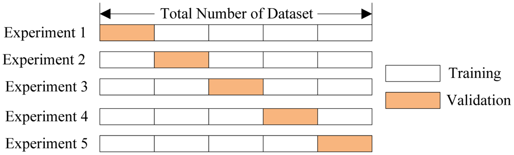
This explains the mystery above - the default of learning_curve is to use the very common 3-fold cross validation protocol so that it has 3 non-overlapping sets to compute cross-validation error on. What we really want to plot here is the average error within each row of train_errors. Note that you can change the number of folds with the cv kwarg.
So, without further ado, I give you the Learning Curves under high bias (underfitting) and high variance (overfitting).
Learning Curve with Underfitting
# Create Learning Curve data with estimator reg_bias
from sklearn.model_selection import learning_curve

train_sz, train_errs, cv_errs = learning_curve(estimator=reg_bias, X=Xall, y=yall, cv=4,
                                              train_sizes=np.linspace(0.05, 1, 20),
                                              scoring="neg_mean_squared_error")

# For each training subset, compute average error over the 3-fold cross val
tr_err = np.mean(train_errs, axis=1)
cv_err = np.mean(cv_errs, axis=1)
# Plot the errors to make a learning curve!
fig, ax = plt.subplots()
ax.plot(train_sz, tr_err, linestyle="--", color="r", label="training error")
ax.plot(train_sz, cv_err, linestyle="-", color="b", label="cv error")

snp.labs("Training Set Size", "Score (4-Fold CV avg)", "LC with High Bias")
ax.legend(loc="lower right")

Interpreting the LC with Underfitting
After using all our training data the model is doing about the same on the CV set as on the training set - that means we don't have overfitting (the model generalized very well). On the other hand in absolute terms the error is high for CV and train, and the curves flattened out very quickly which means our hypothesis didn't change much with the addition of more and more points. Both of those things scream underfitting. Of course you already knew that a straight line would underfit this data :)
Learning Curves with Overfitting
# Prep the X data with polynomial transforms and scaling
Xall_p = poly.fit_transform(Xall)
scaler.fit(Xall_p)  # Don't forget to re-fit, since Xall is different from Xtrain
Xall_p = scaler.transform(Xall_p)
# Create Learning Curve data with estimator reg_var
train_sz, train_errs, cv_errs = learning_curve(estimator=reg_var, X=Xall_p, y=yall, cv=8,
                                              train_sizes=np.linspace(0.15, 1, 20),
                                              scoring="neg_mean_squared_error")
# Compute average errors of the k-fold validation
tr_err = np.mean(train_errs, axis=1)
cv_err = np.mean(cv_errs, axis=1)
# Plot the errors to make a learning curve!
fig, ax = plt.subplots()
ax.plot(train_sz, tr_err, linestyle="--", color="r", label="training error")
ax.plot(train_sz, cv_err, linestyle="-", color="b", label="cv error")

snp.labs("Training Set Size", "Negative MSE (8-Fold CV avg)", "Learning Curve with High Variance")
ax.legend(loc="lower right")

Interpreting the LC with Overfitting
Here we see that the error on the training set begins and remains extremely low, while the error on the cross validation set is quite large. It does seem that the CV error is decreasing slowly with more data points. This is characteristic of overfitting, the model is exactly capturing the training data behavior but is therefore failing to generalize to new points.
One powerful antidote to overfittng is regularization, where we include in the loss function a term that penalizes our parameters $\theta$ for having large values. This has the effect of driving the fit towards a constant and decreasing the variance of the fitting procedure. How to select the best regularization strength? That is a job for a different curve.
Validation Curves for Assessing Meta Parameter Values
Things like regularization strength and polynomial degree are often called meta parameters of your model, and they are typically "fit" by trying different values and choosing the ones which minimize the cross-validation error. This leads us to another very useful diagnostic tool: a Validation Curve plots the training and CV error as you vary a meta parameter. We'll try to find the optimal regularization parameter, alpha, for the polynomial model that was overfitting so badly. A large alpha means a small penalty on parameter magnitudes, because why be logical when you can be confusing.
# Change the regularization penalty of our estimator from 'None' to L2 norm
reg_var.penalty = "l2"

# Construct the validation curve with estimator reg_va
from sklearn.model_selection import validation_curve
alphas = np.logspace(-3, 0, 20)  # The different parameter values to try

train_scores, cv_scores = validation_curve(reg_var, Xall_p, yall,
                                           param_name="alpha", param_range=alphas,
                                           scoring="neg_mean_squared_error")
Just like with learning_curve the default is to do 3-fold cross-validation (which you can change using the cv kwarg), and you average the results at each meta-parameter value to give you a smoother idea of the behavior. Also notice that like the learning_curve function, you can decide what goes on the y-axis with the scoring kwarg.
tr_err = np.mean(train_scores, axis=1)
cv_err = np.mean(cv_scores, axis=1)

fig, ax = plt.subplots()
ax.plot(alphas, tr_err, linestyle="--", color="r", label="training error")
ax.plot(alphas, cv_err, linestyle="-", color="b", label="cv error")

snp.labs("Regularization Strength", "Negative MSE (3-Fold CV avg)", "Validation Curve for Regularization")
ax.set_xscale("log")
ax.legend(loc="lower right")

With low alpha we regularize too much and our model underfits, so cross-val and training errors are large. With high alpha we overfit so trainingerror goes to zero while cross val error gets large. The sweet spot that will minimize our total error of the model is where we did best on the cross-validation set:
alphas[np.argmax(cv_err)]
Want to see what that particular model looks like against the data?
# Create and then fit our Linear Regression Class
reg_var.alpha = 0.078
reg_var.fit(Xtrain_p, ytrain)
# Plot the data and the predictions
fig, ax = plt.subplots()
ax.scatter(Xall, yall, s=100, marker="x", label="data")
ax.plot(xs, reg_var.predict(xs_p), linestyle="--", color="r", label="12th degree Polynomial Model - Regularized")

snp.labs("Change of Water Level", "Outflow of Water", "Hydrostatics of a Dam")
ax.legend(loc="upper left")

This was simple enough with just regularization strength, but with several meta-parameters your validation curve lives in a high-dimensional meta-parameter-space. The GridSearch and pipeline tools are designed for those situations where you want to minimize the cross-validation error over several different meta parameters. I'll dig into those at a later time.
Summary
A Learning Curve is a plot of $J_\textrm{train}$ (calculated on a truncated training set) and $J_\textrm{CV}$ (calculated on the full cross-val set) as a function of $m_\textrm{train}$ (the size of the truncated training set). In Learning Curves underfitting manifests as $J_\textrm{CV}$ flattening out quickly at something close to $J_\textrm{train}$, while overfitting manifests as a large $J_\textrm{CV}$ which decreases slowly, with a large gap from $J_\textrm{train}$ though it will look like the two losses would converge if extrapolated out. You can use learning_curve to generate these values, you just need to pass it an estimator object and your data. You can make a learning curve for any metric of interest, like 0-1 misclassification error, or $R^2$, just use the scoring kwarg.
A Validation Curve is similar, it plots $J_\textrm{train}$ and $J_\textrm{CV}$ but as you vary a meta-parameter of your model, such as regularization strength. You can use validation_curve to generate these values, you just need to pass it an estimator object, your data, and the name of the estimators parameter that you would like vary along with the values it should take.